Today I attempted to translate/associate/explore the sounds and tastes of Gary Strangers graffiti type. I was interested in starting with graffiti as I thought there would not be many universal associations/memories attached to it and was interested in creating quite a raw response. However, this was a lot more difficult that I anticipated. Due to this, I think that using graffiti might be too difficult and also I worry that my responses/outcomes will be too difficult to understand if there are no universal associations to the type - I'm now going to rethink about the type i plan on using.
I chose to respond to the sound and taste after reading about Condiment Junkie who discovered that there is a correlation between sound and taste - e.g. what you hear can affect the taste of something.
Today I also tried mark-making based on general sounds/pitches. I found my result was very similar to the sound response I did during part 1 - so i'm worried that each outcome could look very similar and one may not able to visually distinguish the sounds from one another. I also found this exercise very difficult and I'm not sure whether it was because I was quite tired and unfocussed or if this is a genuinely difficult exercise to do. I am thinking it may be easier to first completely translate/explore/associate the form of the typeface before I start to look at and record the sound or the taste.
10.03.17
WEEK TWO SUMMARY
This was the first week in which I was really focussing on my FMP (the first week I spent writing and correcting my proposal) and truthfully, I don't think this week has been my most productive. I slipped into what we were warned about (knowing when to stop research and losing days on unnecessary research in the internet/library). I think whilst I have done a lot of useful secondary and contextual, I haven't yet touched on primary research or been at all active/practical in my approach to this project - which in hindsight is the approach I should have taken from the start with the 'creation of a personal palette of equivalences' being in my proposal. It seems as though all the research has been interesting and useful but hasn't actually developed my ideas substantially. I initially thought i would have loads to research around this topic but a lot of what I've read/watched/listened to has in a sense just confirmed what i already knew/put it into words. I think that perhaps this past week I've realised that I have set myself quite a challenging proposal and i've almost been avoiding getting on with it by doing excessive internet research and reading.
Another thing that seems to have held me up this week is choosing which typefaces to explore. I hadn't really thought into this when writing the brief and I think I had in the back of my mind that I would just choose some typefaces from an encyclopaedia. But this is such a boring approach to take and i've realised that my choice of typefaces should have more meaning behind it.
Next week I aim to be more active in primary research/development of ideas. I plan to begin the week by taking primary research photographs of typefaces. In regards to which typefaces, I've been thinking about using the the type from restaurants I've been to or from albums/songs I've listened to to immerse the notion of either taste or sound. I think that using album covers might be an issue, as these typefaces already have sounds linked to them, therefore it would not be a personal palette so much - it is arguable that this would be a similar issue with restaurants in regards to taste. I have also thought about exploring graffiti as its less likely to have any universal associations with it and the type used is often very expressive and unusual. I was inspired by the mark-making i did previously to look into graffiti as a potential starting point in terms of type.
Once I have the primary photographs, I can begin exploring equivalences and associations. I can also finally begin experimenting with materials - I'd really like to have attempted the risograph by the end of the week. I should also begin thinking about the the format of the final outcome, although I do think at this point I have a fair amount to do before this stage.
27.02.17
SEMINAR
After presenting my proposal, the initial thought from my group was that this is going to be a difficult project to pursue. I also think this, however, I wanted to set myself a challenging brief as it's just more interesting (especially as we have 6 weeks) but also i think pushing myself usually generates my best work. At the moment I'm quite confident with my proposal and intentions. I'm also looking forward to exploring the ideas/concepts in my proposal (and more).
NEXT STAGES:
(feedback from the group)
- Research into Sarah Hyndman - I've already begun looking into her book The Type Taster (briefly) - also should look into her workshops, her first book Why Fonts Matter and Ted Talk Wake Up and Smell the Fonts
- Research into John Morgan Studio, more specifically Four Corner Books and the 'Familiar Series'
- Think about touch and texture
- Begin thinking about the format of the outcome, the context of the experience
- Overall, try and be more active in testing any visual ideas - even ones that just pop into your head
THINGS I WANT TO AVOID:
- Being cliche - don't choose typefaces that are too familiar, for example, ones that you'd typically use or see on a word processor. I want this project to be personal but still understandable/recognisable/relatable to others.
- Getting too wrapped up in research - know when to stop - i think sometimes i do too much secondary and contextual, forgetting primary.
HEARING HELVETICA
Progress
and Achievement
From the foundation course, I’ve gained a better
understanding of how important critical feedback is to develop. I think the
course has helped me feel more confident in sharing my ideas and also in giving
feedback to others. I think this is vital when producing a successful FMP.
Context
A visit to the Virtual Reality exhibition, Bjork
Digital in December and the recent news of Mat Collishaw’s upcoming VR
exhibition, Threshold, made me begin to think about the future and how artists
and designers are now able to create a perception of being physically present
in a non-physical world. I began thinking about our senses and how we interpret
sensory information in order to understand our surroundings.
Nicolas Jaar, a music producer, recently published
a book of ‘visual essays’ documenting the content from a number of radio
stations. This reminded me of an exercise during part 1 of drawing and
conceptual practice, in which we were asked to draw the sounds we heard around
the room with our eyes shut. The notion of visually communicating a sense I
think is very interesting and made me think about the context of a sensory
experience i.e. a radio in a book, a heard experience is translated into one that
you can now see/read.
Project
Proposal Aims, Methods and Realization
The purpose of my project is to explore the
equivalences of a typeface. I am aiming to create a ‘personal palette’ of my
perceptions and responses to specific typefaces. More specifically, I think it
would be interesting to take the idea of immersing multiple senses and to
communicate what I perceive to be the sound and the tone of a typeface. This
links with my initial interest in how we interpret sensory information in order
to understand our surroundings.
This project will require heavy research into each
typeface I choose to ‘react’ to. I need to think about the visual form, where
is it used/ who uses it as well as my memories and observations attached to the
chosen typefaces.
I thoroughly enjoyed exploring and experimenting
with the ‘Shape of Words’ brief during part 2. Nicholas Jaar, Maziyar Pahlevan
and Anibal Bley’s experimental use of type inspired me to want to explore the
subject more.
I plan to approach this brief in an experimental way
in terms of the materials and concepts. I would like to explore more printing
methods, specifically risography, however I also do not want to limit myself to
a specific material.
Evaluation
During part 2 I found it helpful to write down
thoughts in my notebook as the project moves along and then reviewing and
collating these thoughts with reflection in a blog. I plan to carry on this
method of evaluation and aim to reflect on my blog at least once a week. I also plan to make full use of the organised
seminar groups, as I believe that a second voice is vital to the development of
my work.
HOW HAVE I GOT HERE?
WHICH PROJECTS HAVE I ENJOYED/ WHY?
Blind Date - I really enjoyed this first photography-led brief. I felt it really pushed me to begin using photography as a primary medium for final outcomes.
Shape of Words - I surprised myself with how much I enjoyed exploring and learning about typography. Potentially something i'd like to explore in depth for FMP.
WHICH PROJECTS HAVE I LOATHED/WHY?
I found Change it now very frustrating hence why i still do not have a final outcome for it. I used a very minor subject for this project and one that was very hard to be passionate about so I think i found it difficult to campaign for change.
IS IT IMPORTANT TO YOU THAT YOUR WORK IS HUMOROUS, INFORMATIVE,
SHOCKING AND BEAUTIFUL? WHY?
I think its important for any work to have a one of the above qualities as it sparks a reaction or a feeling from the viewer or audience. The most memorable work is the most effective. I also think humour is an important aspect to include sometimes. On foundation I have found that often people will shy away from making their work humorous, however, whilst researching successful campaigning methods etc during the Change it Now project, I found that humour is usually the most effective way to communicate something as it grabs peoples attention and makes the campaign more memorable.
DURING THE COURSE OF PART 2, HAS YOUR APPROACH TO THE BRIEF CHANGED? WHY?
Over the course of part 2, I don't think my approach to the brief has changed massively , however, I think I have developed a personal approach to the brief which I've found to be very effective within my work.
WHEN PRESENTED WITH A BRIEF, HOW DO YOU GET STARTED? ARE THERE ANY OTHER WAYS TO GET GOING?
When presented with a brief, my first steps are usually to look in the library or on the internet for inspiration and/or some initial research. I write a lot of things down and will have a couple of ideas going at the beginning before fully begin developing one. If i was stuck on a brief I would probably go out and take some photos as its a medium I find i can visually communicate my thoughts effectively or I would go to an gallery/museum.
WHAT OTHER SKILLS WOULD BE USEFUL TO LEARN?
I've really enjoyed all the photography work I've done during part 2 and I'd like to develop this by switching to analogue and really experimenting and exploring the qualities of analogue photography. During part 3, I'd also like to fully explore different printing techniques as its something I feel I only lightly touched on during part 2 as it was so new to me.
HOW MUCH USE DO YOU MAKE OF THE RESEARCH YOU DO?
I think one of my strengths is successfully making my research visible in the final outcome. For me, research is an important part that full use should be made of.
WHO DO YOU GO TO FOR FEEDBACK DURING A PROJECT? WHAT EFFECT DOES THIS HAVE ON YOUR WORK?
I don't find myself asking for feedback during a project that often, but when I do I like to go to multiple people before reflecting and analysing what they've said. I find before I take action with anything, I'm someone that likes to read everything and listen to everything before making a final decision.
TWO EXTRAORDINARY BOOKS
Brief: Create a book giving careful consideration to form and function.


BOOK OF LIES
How do I make a book extraordinary? – I struggled for a while with this project as the books by past students shown to us took such innovative and extraordinary forms whilst none of the ideas I was coming up with excited me. I initially began thinking about a Book of Discoveries as I knew I was travelling to Iceland at the same time I would be producing this book. Even in Iceland, however, I still was finding it difficult to find inspiration. So I begun thinking less about the actual book form and decided to focus on the content of what the book might include. In Iceland I was really interested by the branding in their supermarkets and also some of the graffiti around the main city, Reykjavik. So for the remainder of the trip, I thought i'd take a lot of photos and see what they could develop into. The thing I was worried about was the book looking like just a book of 'holiday photos'. The book developed into a Book of Lies, after thinking about ways in which I could avoid 'holiday photos' and research on Ed Ruscha. I think adding the text avoided this, giving the images a good basis of context and substance. I think I was successful in terms of where I placed the text. I tried to make sure that the text worked with the photo and that it became apart of it rather than the two being separate things, to create atmosphere and fluidity through the image.
I think on the whole, the lies in the book work well, however looking back, some do not work as well as other do and should be revised. 'TITANIC' and 'I'M ON A DIET' are two in which I think get lost in the book. The type of lie I am telling should be revised and should also be consistent throughout the book. Originally, this book was going to be a concertina of images
presented inside an Iceland supermarket bag that acted as the front and the
back cover. I thought this would compliment the humour and would also add the
extraordinary element to the form that I was searching for. This, however, did not work so well. The plastic was too distracting and the bag form was not a suitable function for a book. I also decided that the content by itself was sufficient enough by itself in communicating the concept of the book.
If I had
more time to develop this book, I think I would think about the icelandic language and
incorporating that into the book somehow. I also would have spent more time
thinking about the book form. I would have printed the book landascape as I
think this layout would have been more complimentary to the photographs which are
all landscape. I also should have focused
more on the binding and creating a studier hardback cover. Risograph prints pinpointing some of the best images would also be a nice edition alongside the book.
A MOVING BOOK (1-DAY GROUP PROJECT)


I usually find one day project quite challenging. I think my initial idea generating process usually starts of quite slow as I like to think about everything very thoroughly as well as leave and come back to things whilst with only one day to complete everything you have to make decisions quickly and be effective with the short amount of time you have.
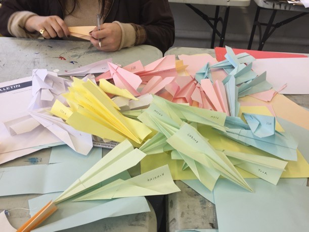
i found the idea of a 'moving book' quite difficult to wrap my head around - it didn't make any sense to me. The boundary of when it stopped being a book and how much it had to move was unclear. I think the problem with this project was that i wasn't completely clear about the group idea therefore quite confident with what we were working towards as I couldn't quite visual it. But when we started to properly put it together the concept became clearer in my head and I turned out to be quite pleased with our final outcome.
I think that overall our concept worked well as a moving book. A strong aspect of the project was the placement of the planes which created something very atmospheric and poetic - you 'get lost in the book'. Also having people make their own story was very effective, as it kept the audience engaged and focused.
A MOVING BOOK (1-DAY GROUP PROJECT)


i found the idea of a 'moving book' quite difficult to wrap my head around - it didn't make any sense to me. The boundary of when it stopped being a book and how much it had to move was unclear. I think the problem with this project was that i wasn't completely clear about the group idea therefore quite confident with what we were working towards as I couldn't quite visual it. But when we started to properly put it together the concept became clearer in my head and I turned out to be quite pleased with our final outcome.
I think that overall our concept worked well as a moving book. A strong aspect of the project was the placement of the planes which created something very atmospheric and poetic - you 'get lost in the book'. Also having people make their own story was very effective, as it kept the audience engaged and focused.
THE ALCHEMY OF DESIGN
Brief: take a complex scientific theory create a simple visual explanation of it through moving image.


 |
| Final image used in gif |
I chose to research radiation for this project as I thought it would be the least obvious one to choose (others included were: evolution, virus, bacteria, etc). It was also the one which I immediately could visualise in my head (osmosis was the other). I found there are many types of radiation such as nuclear or acoustic radiation. Electromagnetic radiation or more specifically visible light was what interested me the most. I really enjoyed enjoyed the research stage of this project. I think that my research was very thorough and I explored my subject fully. However, this project did make me realise that the majority of my research is often word led. I think more physical engagement would help me develop my work further and take me out of my comfort zone.
If I had another week on this project to develop my final outcome, I think I would have explored placing it into context by introducing a simple narrative to make the gif more informative. For example, what gives off radiation?I think overall my exploration and experimentation of materials was good, however, there is more I could have experiemented with, such as using flurescent paper as a backlight to create a glow round an object or I would have loved to experiement with phosphorescent powder or paint. The overall income was not as fluid as I would have liked it to have been, I think more time was needed on creating it. I also think I could have thought about using something other than a white line for the light to go through. Also looking back at the gif, I was worried that the image I chose looked quite similar to a bird or a plane with its wings. – was worried that the meaning would be misunderstood due to this but actually during the crit this seemed to be okay. I wanted to focus on creating something more abstract and beautiful rather than something very literal and sort of childish I guess. I think I succeeded in this, as if you think about what I am communicating, the gif is actually very literal but if you are trying to work it out, it does take a bit of thinking. Something else which also could have been quite interesting is edited some of the images together or making video of light painting like Kim Pimmel or Immaterials.
Critical feedback: 'Sense of exploration - looks at a range
of artists - and good experimentation of materials'
'Accurate technical communication and effective image making but could have been more experimental'
'Research is visible in final outcome'
Subscribe to:
Posts (Atom)